
A Dutch designer
in Budapest

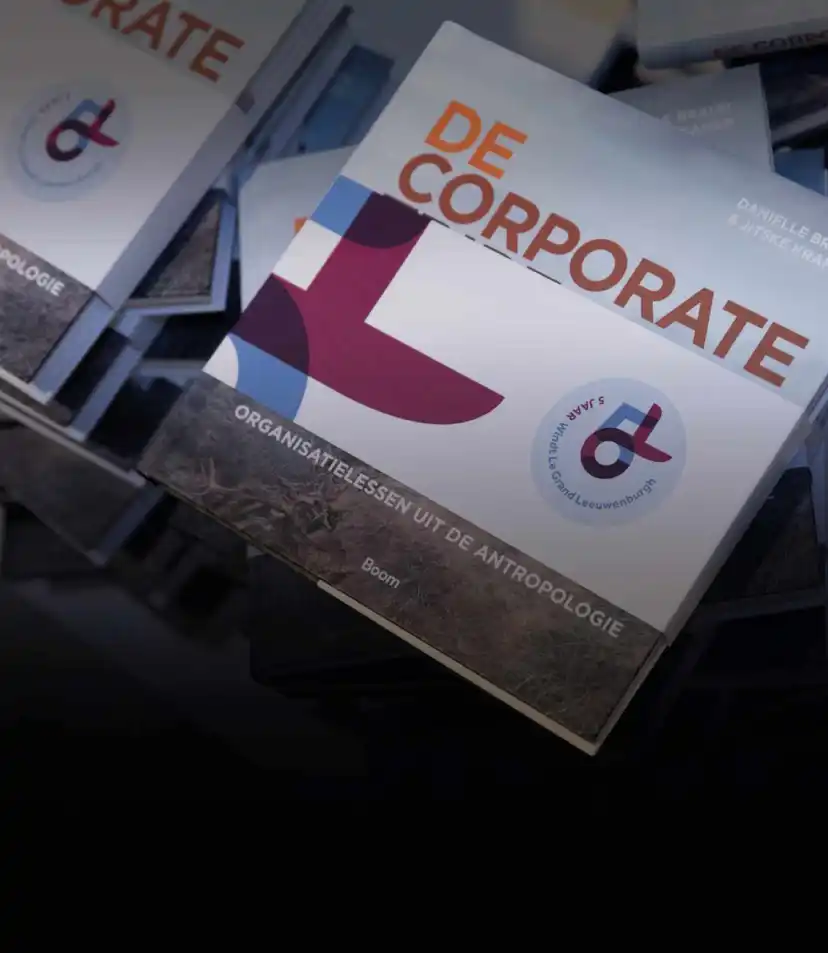
Windt Le Grand Leeuwenburgh is an independent law firm based in Rotterdam Specialized in the most relevant areas for entrepreneurs, corporates and investors.
more


A valet service operating at schiphol airport in The Netherlands.


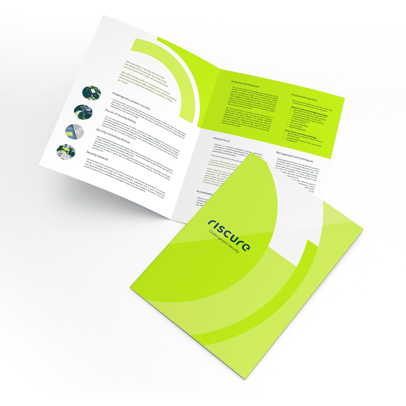
Riscure is a leading device security tester and toolmaker.
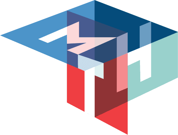
The circle is an important, easy to recognize visual element in the online and printed communication. It gives the brand it’s vibrant ambiance. The strength lies in it’s gaps. It plays with the eyes, (seemingly rotating).
more


Clients say:
"Besides his high quality standards, which he will never disown, Ron is the perfect business partner when it comes down to creativity and design"

"Ron has always been able to capture all our thoughts and ideas into amazing content from flyers, website, banners, logos and much more"

People often think design is just about making things look good. But it’s really about creating the right visual language and choosing the right shapes, colors, and fonts to tell a story in the best way possible.
Of course, we still want things to look great—good design is a balance of style and clear communication. It’s not one or the other; they work together.
When I create a logo or website, I make sure it’s not just visually appealing but also gets your message across clearly and effectively. A consistent style helps your brand stay recognizable and memorable for years to come.

Contact
